How do you get more conversions from mobile website users?
The basic answer is to create a seamless, delightful user experience (UX), specifically when your site is viewed on mobile screen sizes. In fact, building a “user-friendly” website has now become nearly synonymous with building a “mobile-friendly” website. This is because of two important trends:
- More people are accessing the web from smartphones than ever before (source).
- Google is now ranking websites based on their mobile friendliness (see Google’s mobile-first indexing guide).
To further explore these concepts, in this post, I’ll provide an overview of some common mobile-specific conversion rate optimization (CRO) strategies so that you can get more business from your smartphone traffic.
(And shout-out to Soala Idasetima and Michela Leopizzi for the help researching and editing this post!)
What is Mobile CRO?
Mobile CRO refers to any process or method meant to increase mobile conversions—meaning the rate at which mobile website visitors complete a desired action such as filling out a form or making a purchase.
A few basic definitions are also helpful to keep in mind:
- Conversion rate – The percentage of users or sessions that resulted in a desired outcome, such as filling out a form or making a purchase.
- Mobile conversion rate – The conversion rate for your website segmented to only sessions viewed on a mobile device. (Note: In most cases, we only look at mobile devices. Some marketers like to combine both mobile and tablet visitors into their “mobile” audience. There is no “right” way to do this, but it’s most common to look just at mobile users and to consider tablets separately.)
- Mobile responsiveness – The ability of a website to function appropriately when viewed on a mobile device (mobile screen widths are defined by the “viewport” size, which is typically around 320-415 pixels wide).
Mobile website – A dedicated mobile website is often a condensed and redesigned version of a desktop website. Sometimes known as an “m dot” website because they use mobile subdomains, such as website.com, this approach is now less common since most websites are designed to be responsive.
Mobile-friendly website – A mobile friendly website is any website that “works” when accessed on a mobile device.
Conversion rate optimization – Also known as CRO, this is the process of increasing the conversion rate of a website with various tactics such as improving user experience, removing blockers/impediments to the user flow, increasing access to conversion funnels, and improving things like page speed. The process typically involves testing and making gradual improvements over time.
How to Find Your Mobile Conversion Rate
In order to determine a given website’s mobile conversion rate, we typically use Google Analytics.
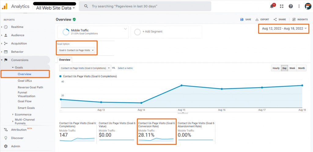
In the “old” GA (also known as “Universal Analytics” or “UA”), you could do this by simply visiting the Goals Overview report:
- Go to Conversions > Goals > Overview
- Choose your desired date range and be sure to select the “Goal” that you would like to measure.*
- Find the Goal Conversion Rate box under the line graph.
*Note: This process requires setting up a Goal in GA.
If you are using an ecommerce website, you will use ecommerce transactions instead of Goals.
Now that GA is making the transition to GA4, the process will work a little bit differently. For one thing, Goals will no longer exist, so you will need to set up a Conversion event instead. Once that’s ready, follow these steps:
- Visit Reports > Engagement > Conversions.
- Be sure you have selected your desired date range.
- Click the “All Users” filter at the top of the page.
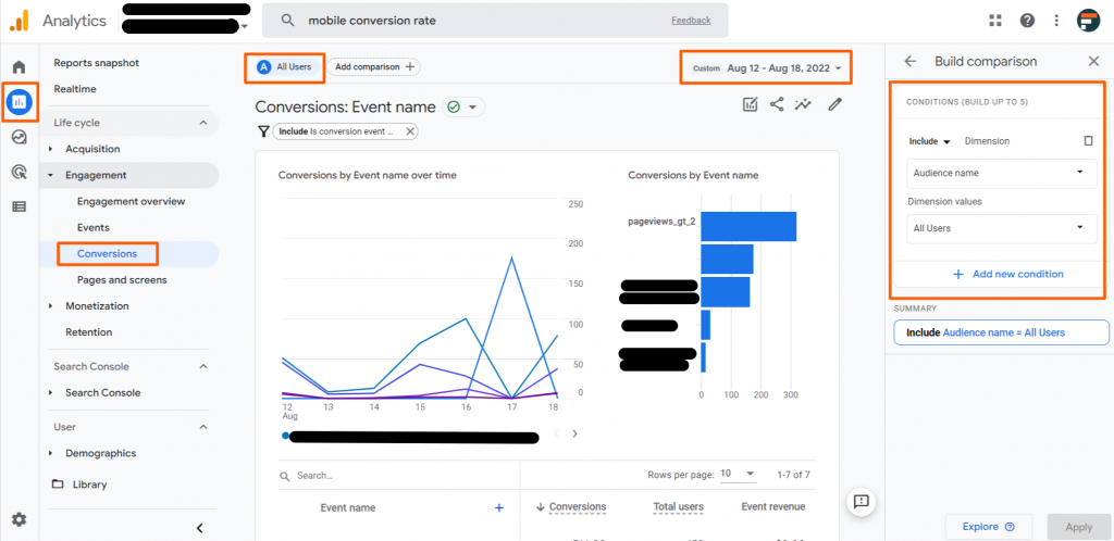
- In the sidebar editor, click the first dropdown (that says “Audience name”) and start typing “device” then choose select “Device category.”
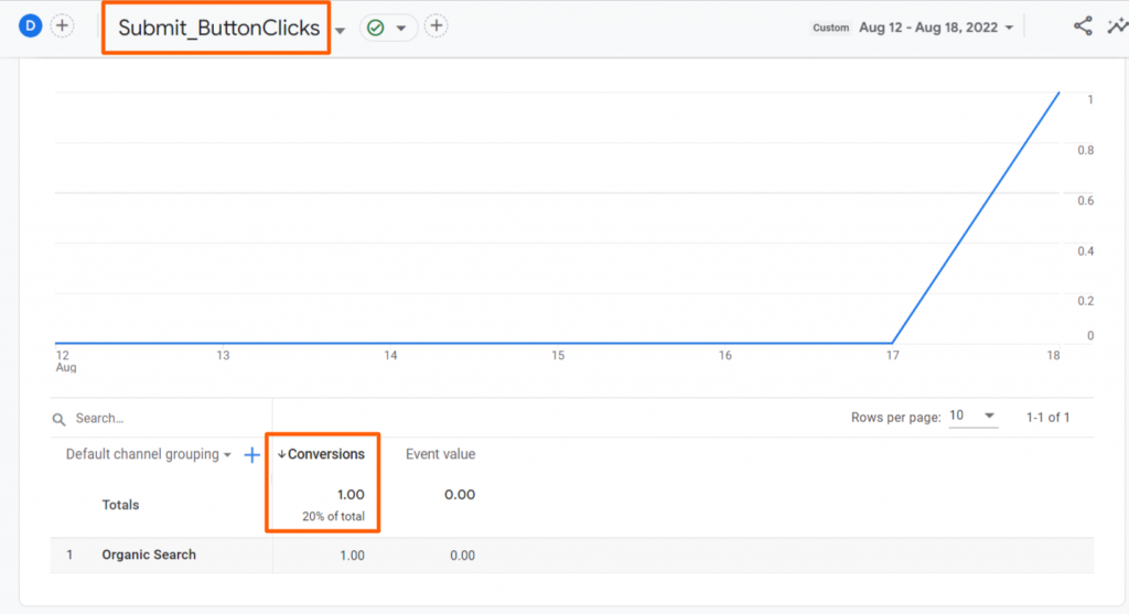
- In the second dropdown, check “mobile” and then click “Ok” before closing the dropdown menu. Click Apply at the bottom of the sidebar menu.
- In the table beneath the line chart, click the name of the Conversion event that you would like to filter down to. (If you only have one Conversion, skip this step.) The title area of the report will change to reflect your selection.
- You will now see the total number of conversions, followed by a % of total.
WHAT IS A GOOD MOBILE CONVERSION RATE?
Once you find your mobile conversion rate, your next question is likely, “So, is that good?” The answer, as usual, is “It depends.” (For some, it’s “Whatever doesn’t get you fired.” 😊)
You might see that other websites answer this question by mentioning industry benchmarks or other numbers that result from various studies or samples from experience. For example, one site mentions that anything above 1% is considered good.
The truth is that a good mobile conversion rate will depend on many factors such as your industry, what you’re measuring, your business goals, and much more.
- In my opinion, the most important thing is to figure out what your current conversion rate is so that you have a baseline. Once you know where you’re starting, you can then determine if that rate will be effective in terms of reaching your goals.
- If you feel that your performance is poor and that a higher rate is necessary, then you should move on to the Mobile CRO methods outlined below.
How to Optimize UX for Mobile Devices
The main goal of mobile CRO is to facilitate a frictionless conversion path.
As mentioned earlier, improving user experience (UX) is a core framework when it comes to increasing web conversions. Optimizing a website for mobile devices (or search engines) is important, but at the end of the day, the reason we’re doing this is in order to provide the best experience to the users of the mobile site.
Improving mobile UX can mean many things, from cleaning up the interface and properly formatting a hamburger menu to identifying obstacles or improving mobile page speed. All of these things improve UX and can therefore improve your rates of conversion.
Below are some specific methods you can consider implementing for your website.
Optimize Calls-to-Action (CTAs)
Ask yourself: Are there obvious “next steps” on your key pages when viewed on mobile? Do existing CTAs make sense for the likely intent of the user who has visited this page? Are there too many options and could you narrow the focus to one primary CTA per page? Are there CTAs placed between large sections of content? How does the spacing differ on mobile compared to desktop?
The elements near CTAs are just as important as the buttons themselves. Consider how you can highlight the value of converting as well as the reason to trust and believe in the company. For example, if users can see your industry awards, security seals, and customer satisfaction badges close to the conversion paths, they will be more likely to follow. This improves trustworthiness by highlighting your expertise and authoritativeness (the core components of EAT principles).
Language that creates a sense of urgency can appeal to emotions and contribute to higher conversion rates. It’s important to do these in an ethical way and to use them sparingly in order to avoid looking like a scam artist, but elements such as countdown timers have been shown to lead to higher rates of conversion.
- Other psychological triggers
- Use photos with human faces
The checkout process is one of the most important user flows on an eCommerce website, so it’s important to audit this user flow to see where you might be able to cut back on user requirements, especially for mobile users.
Ensure the forms are easy to use and consider condensing sections to help with the process. You can also take advantage of digital wallet options such as Apple Pay or Paypal to make the process potentially even smoother than on desktop.
On a lead generation website, forms are the equivalent of the eCommerce site’s checkout process. So be sure to explore ways to simplify these forms, too.
One strategy that can help forms both mobile and desktop is to break long forms into multiple steps. (In UX this is sometimes called a tunnel user flow.) Pairing a multi-step form with a progress bar and/or a page counter is also key, so that users can see their progress without worrying that form will never end.
Consider also asking for feedback on how the process went at the end, to identify hidden problems that might be preventing a higher conversion rate.
If you’re using interstitials (aka “pop-ups”), be sure to test them at all screen sizes to identify problem areas.
You will want to avoid pop-ups that take over the entire screen. (In fact, this goes against Google’s guidelines.) Instead, be sure that users can tap the area around the pop-up and/or the “x” button in order to close the ad.
Another common issue is that pop-ups keep coming back even after closing them multiple times. So be sure that the triggers are well-defined. It’s best that if a user closes it once, it doesn’t appear again even if they go to a different page.
You should also explore common triggers so that pop-ups appear when a user is showing signs of exit intent, or after a certain period of inactivity. This can be a very effective way to improve engagement and conversions.
When auditing your mobile user experience, be sure to interact with items such as chat that may behave in unexpected ways on a mobile device. When considering new plugins and services, be sure to consider mobile-friendliness before you install them.
Optimize User Flow
How does the main nav work on mobile? Can you access everything? What about secondary navigations, like sidebars/local navs and footers?
To avoid overwhelming users with content, you should eliminate distractions, create better hierarchies, or even collapse larger sections of content into accordions. This can be a great way to optimize content for smaller screens (I’m a fan of how Wikipedia collapses sections of content into accordions – see example below.)

Fix Technical Issues Impacting UX
People expect instant loading on the web. If your site is lagging, you’re losing money.
Use Google Analytics and/or Google’s PageSpeed Insights tool to identify technical issues that are leading to slow load speed. (Tip: Since different tools can provide vastly different results, it’s often helpful to use more than one. I’ve used speed test tools provided for free by Uptrends and Pingdom.)
There are myriad ways that accessibility (also sometimes called “a11y”) can become an issue on a website. Some of the most common issues, especially on mobile, include color accessibility and touch targets.
- Regarding the former: be sure your text has enough contrast with the background behind it by using a color contrast checker tool such as Colorable.
- Regarding the latter: Run your page through Google Chrome’s Lighthouse tool (now also available on the dev website) to check for issues such as elements that are too small or too close together on mobile.
While it’s not 100% necessary, some website managers choose to create a distinct website for mobile users. This can be a benefit in many ways, including increasing page speed. This is most common for web applications (think Facebook or YouTube). The major drawback is that you now need to maintain two separate websites, which is one reason that designing a responsive and/or mobile-first website is generally favored these days.
Note: There are some mobile website strategies that used to be popular but are either no longer best practice or are not supported altogether. Significantly different m-dot sites are one example (greatly reducing the usefulness of a mobile site is now discouraged by Google). AMP webpages were also quite popular a few years ago as a way to provide near-instant loading. AMP pages were seen as favored by Google, but are no longer seen as a top priority.
Broken links are a major issue when it comes to keeping users engaged on your website. You can use tools such as Screaming Frog to identify internal linking issues (like links that lead to 404 Error messages or redirect chains) as well as broken images or unplayable videos. Be sure to fix these links or remove them entirely.
It’s important that your website can be viewed effectively at all screen sizes. According to Google: “Because visitors to your site use a variety of devices with varying screen sizes, your pages should specify a viewport using the viewport meta tag.” There are strategies in CSS and HTML (such as sizing the content to the viewport) that will ensure that a site can “respond” to any given size and still be usable. Be sure to avoid using fixed-width viewports, and avoid setting an unrealistically wide minimum viewport.
Use handy tools to automate the process
Run your page through Google’s Mobile Friendly Test to see if it is compatible for mobile users.
Use the URL Inspection tool in Google Search Console to ensure that Google can correctly “read” and render your site’s mobile content.
Using a tool such as CRO Checker can quickly identify additional areas of concern for your website/webpage.
You may also want to reference this Google documentation page for more information on common mistakes made when designing for the mobile web, as well as the best practices related to Mobile-First Indexing.
How to Optimize Content for Mobile Users
Strong content is key to any digital marketing strategy. While there is certainly some overlap with the UX approaches mentioned above, the following tactics are specific to optimizing content for mobile sites.
Short and simple content is the best approach for a mobile audience—but that doesn’t mean you can’t provide complexity or that you need to keep pages as short as possible.
The key is to present content in chunks that can be easily scanned. It’s crucial to utilize a variety of formatting to create logical hierarchies, such as bullets and a logical heading structure (H1s, H2s, H3s, etc.).
Make suggestions such as utilizing short copy, bullets and lists, sub-headings, highlighted key terms, and having adequately placed visuals.
One of the best ways to improve the usefulness of a given webpage is to provide links to related content that would satisfy the needs of a user beyond what is directly on the page. This is also a key conversion tactic, because you can funnel people further into the site and keep them engaged with your brand.
Look for ways to provide related content in a manageable way, such as by setting up Related Products carousels or Additional Resources widgets. Ideally, these can be autogenerated using a built-in taxonomy on your site (such as by using category or tag systems). You can also showcase products that are frequently purchased together or upsell related products during an eCommerce checkout process. Just be sure that these recommendations are easy to use on mobile. You may want to provide a way to close/collapse the recommendations, too, to reduce frustration.
Answering common issues or questions with an FAQ list is a great way to increase conversions. These questions can be sourced from existing customers or other research methods. Providing strong answers might convince more people to follow through with a conversion.
In order to optimize FAQs for mobile, take a look at the format of the content. An accordion layout is common, so be sure that the widget performs well on mobile. Look out for accordions whose inner content spans more than one screen height, and consider if this causes issues. The opening/closing interaction can also behave unexpectedly, especially if opening one accordion closes another, so be sure to test this to make sure the page doesn’t scroll around erratically.
How to Fully Utilize Your Website’s Mobile Capabilities
Once you have implemented some of the tactics above, consider additional ways to keep building on your success. Here are a few top strategies.
Be sure you are setting up targeted KPIs that you can track in Google Analytics or Google Data Studio. Ideally, you can drilldown to mobile users specifically in order to see how your changes are impacting user behavior.
For example, consider designing a report that shows you how many mobile users end up completing a desired conversion over time. You can also include a table with a breakdown by site segment in order to see how conversions differ depending on their entry point to the site.
If you’re using a paid strategy, retargeting can be a very cost-effective way to improve conversions. In Google Ads, you can create an audience type that is specific to mobile users if desired and then show display ads that remind them of your brand and bring them back to the site.
With all of these tactics, respecting users should always be top of mind. It’s important to give people the options they need in order to create pleasing and frustration-free experiences.
For example, make sure you have a visible privacy policy as well as messaging or assets that provide transparency with how user data is collected and stored. It’s also best practice to allow users to deny cookies (especially if you are a business working in areas that have strict privacy regulations such as GDPR).
Key Takeaways
Now that you are a master of mobile CRO, which tactic will you be implementing first? Will you be focusing on user experience, content, measurement, or something else?
Be sure to share how these strategies worked out for you in the comments below.
To learn more about why our clients love partnering with FourFront for various digital marketing needs, check out one of our Services listed below or send us a message about how we can help you generate more business from your website.


